Update 2:
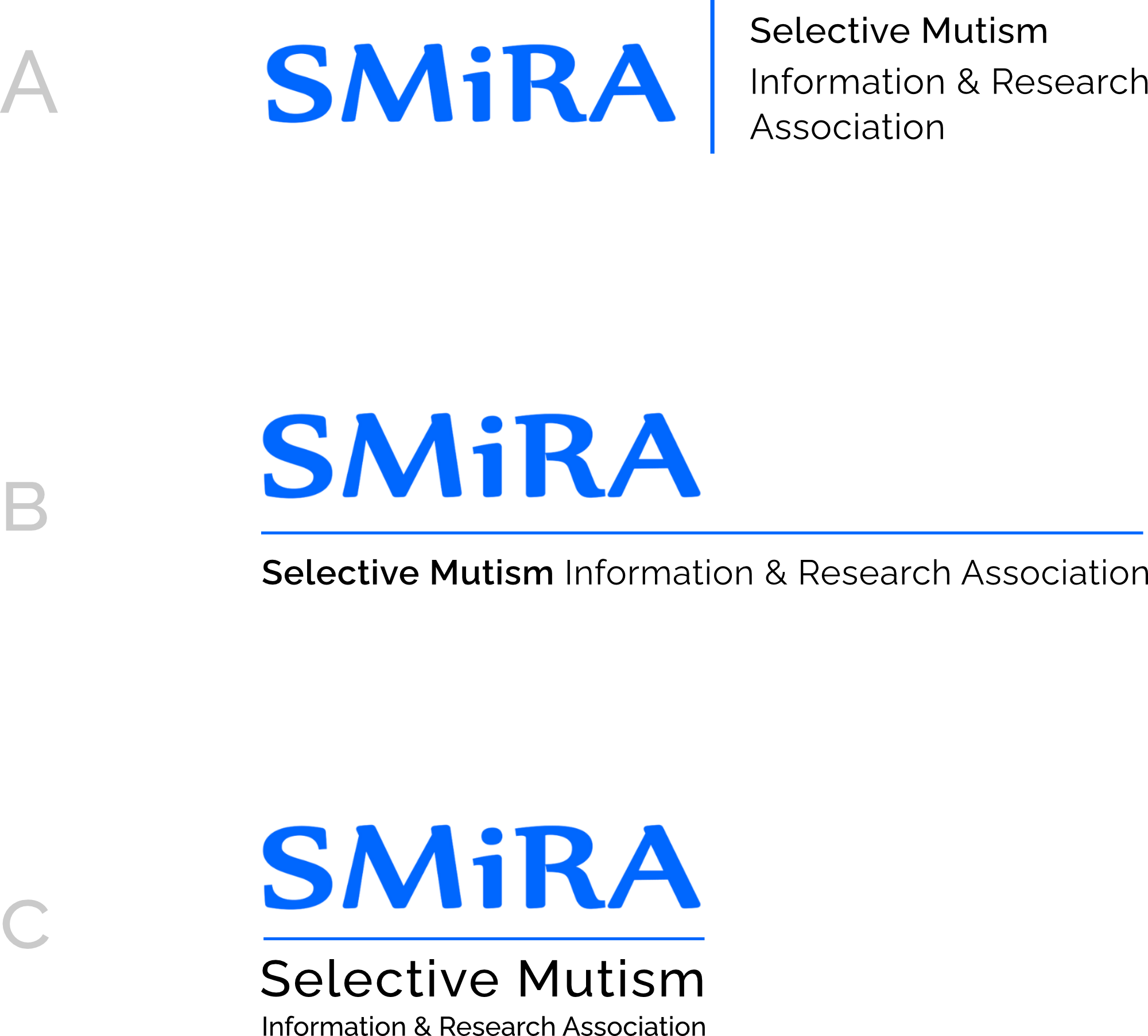
Hi again! Based on feedback I've narrowed down to 3 options, A B and C above.
I've tested printing them all out at logo size on A4 paper, and they all work, although C would have to be a slightly larger size due to the relatively small text on the third line.
Of these, my personal preference is for A - it's the clearest to read and would work well at many different sizes, including the website header and on A4 letterhead. It would also work well as a banner or on posters, flyers etc.
B would work similarly, although the small text is slightly smaller so less readable at small sizes. C looks good too, although as I say care would have to be taken to use it at a certain minimum size to keep it readable.
I've kept the original drafts below in case you want to refer to them.
Let me know what you think.
Thanks
Mandy

Update:
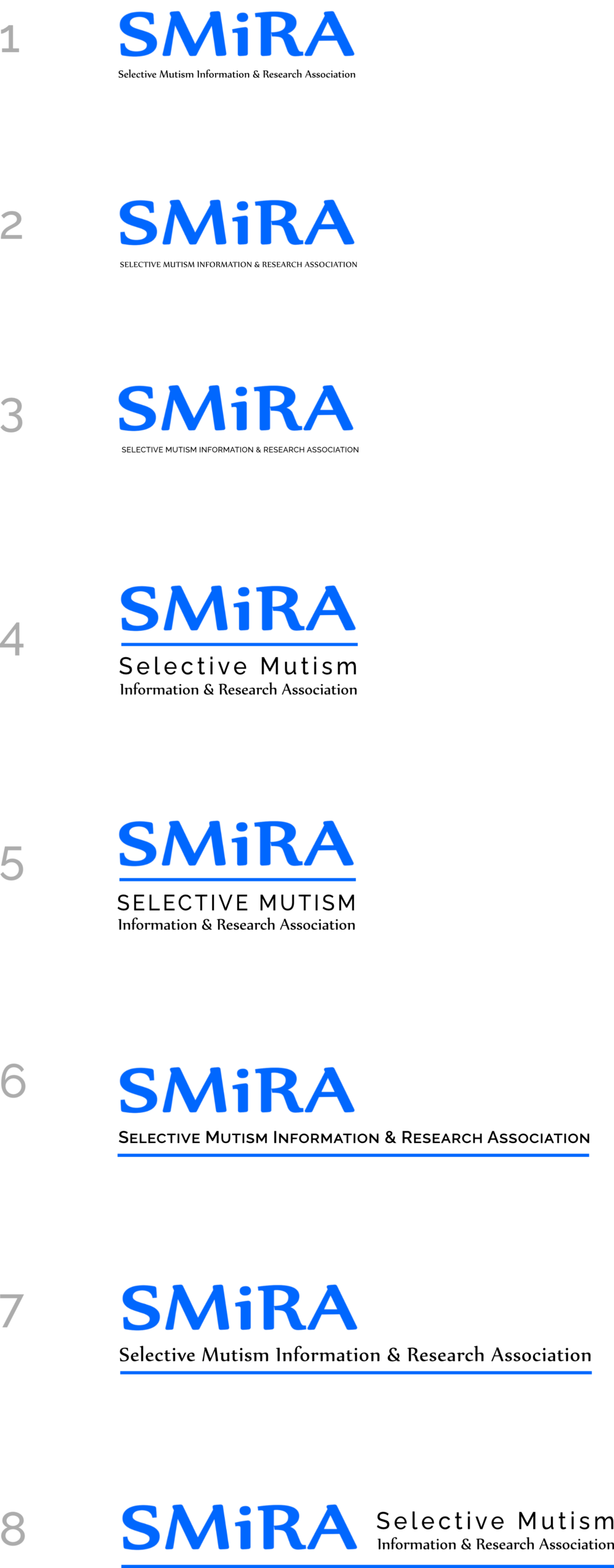
I've added options 9 and 10 which give a lighter treatment.
Notes:
Hello! I've tried a few approaches to replacing the strapline on the logo (which I think is a good idea btw).
I've used two different typefaces for the mockups. The serif font is Nyala which I'm fairly sure is the font originally used to create the blue logo. The other (sans serif) font is Raleway to match the headings and menu on the website.
I haven't used the font which is currently on the 'challenging Selective Mutism' tagline as it's quite informal and doesn't reproduce well.
As you'll notice, options 1 - 3 are very hard to read at the size that the logo would appear on the website, and this would also be the case at the size it would appear on a letterhead for example.
Given this, I've explored other options which allow the strapline text to be bigger. These aren't exhaustive but give an idea of what's possible.
If you can give me some feedback on the direction you prefer I can work towards a final version?
Thanks
Mandy (web designer)